|
So far we have covered some
useful basics and ventured a bit into more advanced concepts. Now we’re
going to look at working with the color of an image.
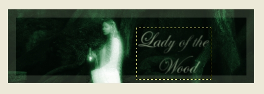
COLORIZING
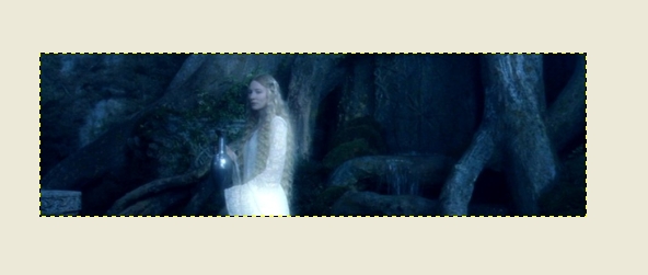
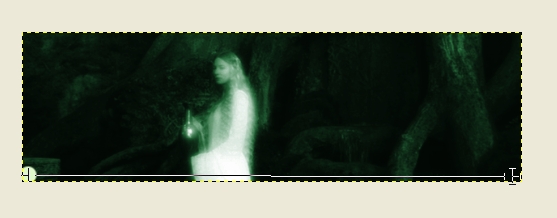
Start with a 500 by 150 base
image and THIS picture. Copy and paste the picture of Galadriel onto the base. Go to Layer>Scale Layer and select a width of 510. Position
it so that Galadriel is where you want her. You can anchor the layer at this
point if you wish—for this effect it doesn’t really matter.
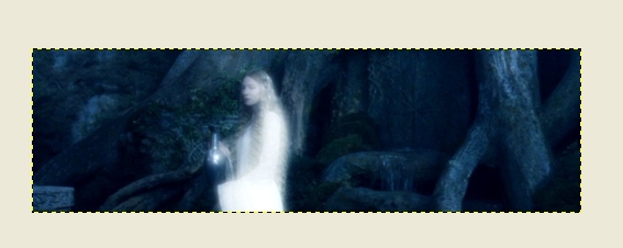
This next step
is optional—you don’t have to do if you don’t want. I went
to Filters>Artistic>Softglow and applied it using the default settings.
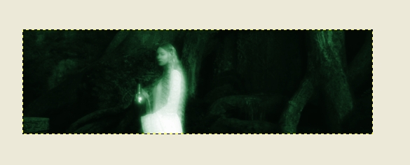
Now comes the color part. Go to Tools>Color Tools>Colorize. Set
the Hue
to about 140, the Saturation to 50, and the Lightness to 14. That’s the
colorizing part but let’s look at what we can add to this graphic.
First thing is a border. Make a new layer by going to Layer>New Layer and hitting okay. Go to the brush tool and select Circle (19) for the brush and “dff9ca” for the color. Now go back to your image and make a circle in the bottom left hand corner. Holding the Shift key and the left mouse key down, move the mouse towards the bottom right hand corner. When the thin line that appears is straight and you have reached the corner, let go
of the mouse key. Repeat so that you have a rectangle around the outside of the
picture.
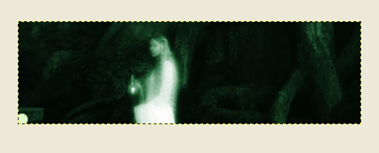
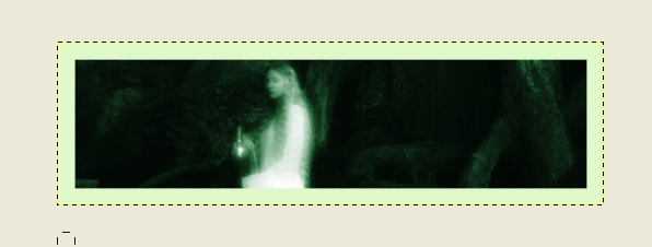
Now go to the
eraser tool and select the Galaxy, Big brush and an opacity of about 20. Erase
as many times as you wish.
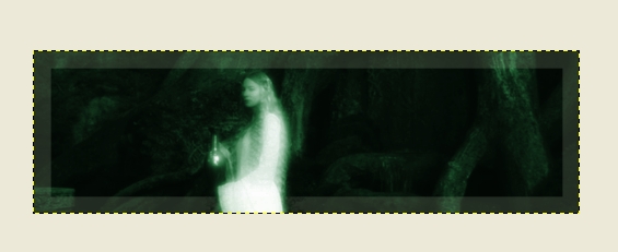
Now we can add
text. Go to the text tool and select Edwardian Script for the font. You may keep the same color or use another one. Select a font
size of about 45. Then click somewhere on the picture and type whatever you wish. I used “Lady of the Wood” since I colorized the image to green (I wanted
to highlight that aspect of Galadriel’s character).
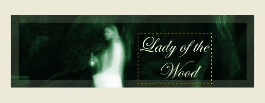
Now go to Filters>Blur>Gaussian
Blur and set the radius to 2.0.
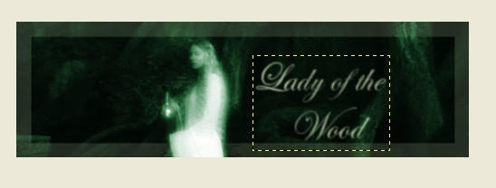
You can now erase it a bit
if you wish or simply stop here. This is my finished product:
COLOR BALANCE
Suppose that
we don’t want to completely change the whole image to the same color but we do want to make it more yellow or red. To do this we can use the Color Balance Tool.
This is located under Tools>Color Tools>Color Balance.
Open THIS PICTURE. Suppose we want to make it redder. Copy
and paste it onto your base image. Now scale it down so that the width is at 510 pixels.
Reposition it so that Arwen is visible. You can anchor it now or later—for
this effect it doesn’t matter.
Now go to Tools>Color
Tools>Color Balance. Move the Cyan/Red one to about 75, the Magenta/Green
to about -10, and the Yellow/Blue to about -30.
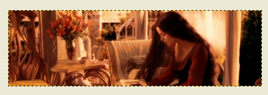
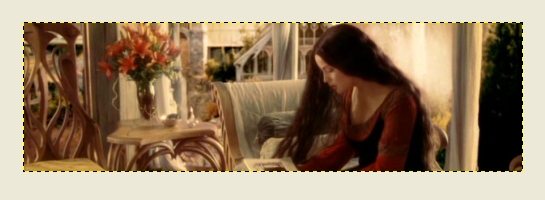
SATURATION
Changing saturation can have
two effects depending on whether you add saturation or take it away. We will
look at both.
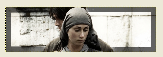
First, let’s use a
500 by 150 pixel base image and THIS PICTURE. Copy and paste the image onto your base and scale to a width of 510. Position it so that the figures are roughly centered and anchor it if you wish.
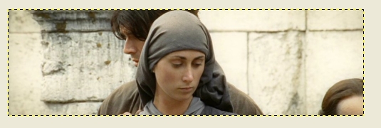
Now go to Tools>Color
Tools>Hue-Saturation. Set the saturation to about -60.
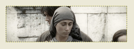
This is really
all you have to do for the saturation part but let’s look at what else we can do with this image. First let’s increase the contrast. Go to Tools>Color
Tools>Brightness-Contrast and move the contrast up to about 50.
Our focus is on the couple so let’s get rid of the head at the right
side of the picture. Use the dodge tool and the Big Galaxy brush and continue
dodging until it’s gone.
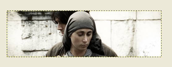
Now we can add
a border. Add a new layer. Go to
brush and select Circle (19). Select “050505” for the color. Use the same technique as the Galadriel banner.
Go back to eraser and select the Big Galaxy brush.
I erased the whole thing
once and then erased all the border that’s over the couple. Then I erased
the whole thing once more.
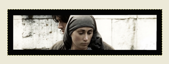
Now let’s look at increasing
saturation. Use a 500 by 150 base image and THIS PICTURE. Copy and paste it and then scale it.
Anchor it if you wish.
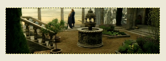
Go to Tools>Color
Tools>Hue-Saturation. Increase the saturation to about 75.
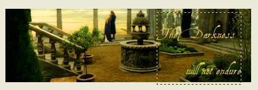
You can continue
to work with this graphic. I used a font called Aquiline and wrote “The
Darkness will not endure” in “e3c434”.
CONTRAST
For this we’ll be stepping
away from Lord of the Rings briefly and using an image from the 1995 BBC/A&E Pride and Prejudice. The screencap is from Longbourn.
Use a 500 by 150 base image
and THIS PICTURE. Copy and paste it and position it so that Lizzy is visible. You can anchor if you want.
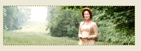
Now go to Tools>Color
Tools>Brightness-Contrast. Change the contrast to about 40 and the Brightness
to about -20.
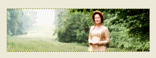
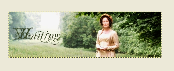
As with the last
few images, you can now add more effects or text. I used a font called Blavicke
Capitals and the “364421” color to add a “W.”
I then added a new layer
and, using a font called Mutulu I continued with “aiting.”
|


